R: swarm plot の作り方
UB3/informatics/r/swarm_plot_r
このページの最終更新日: 2026/04/09- 概要: Bee swarm plot とは
- Beeswarm plot の作り方: beeswarm パッケージ
- Beeswarm plot と boxplot を重ねる
- Beeswarm plot に平均値の直線を追加する
広告
概要: Bee swarm plot とは
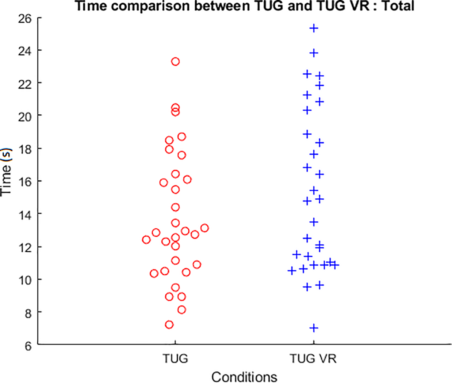
Bee swarm plot とは、図 (文献 1) のように、重なる場合には見やすくなるように横に広げつつ、生データをそのままプロットしたものをいう。
swarm は「群れ、大群」という意味で、蜂が群れているように見えることから bee swarm plot と呼ばれる。beeswarm とスペースを入れない書き方もよく見るので、このページでは以後そう表記するようにしたい。個人的には、どこが蜂の群れなのかよくわからないが。
日本語では、スウォームプロットとカタカナで書くか、「蜂群図」と書かれるようである。
Beeswarm plot は生データを表示できるので、平均値などを表示できる ボックスプロット や バイオリンプロット に重ねて使われることが多い。
たとえば、下の図は beeswarm plot と box plot を重ねたもの (J Neurol Neurosurg Psychiatry, 87, 650-655, 2015)。論文では、できるだけ加工していないデータを含めた方が情報量が多いので、単なるボックスプロットよりもこちらが好まれる。
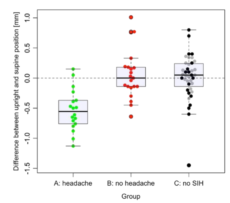
Bee swarm box-plot data with means and SDs showing the differences between groups. Bee swarm box-plot data with means and SDs illustrate the differences (Δ) in patients with orthostatic headaches (Group A, green), without (Group B, red) and patients without an spontaneous intracranial hypotension (SIH) diagnosis (C1, grey, internal control and C2, black, external control).
広告
「あとがき」で当サイトを参考にしたと書いてくれているラノベです。Kindle Unlimited で読めました。ストーリーと文章が良く、面白かったです。
Beeswarm plot の作り方
R の beeswarm パッケージを使う (2)。インストールしていなければ、まず install.packages("beeswarm") を行う。library(beeswarm) で読み込んでから、関数 beeswarm を使用する。
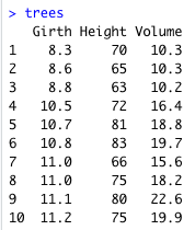
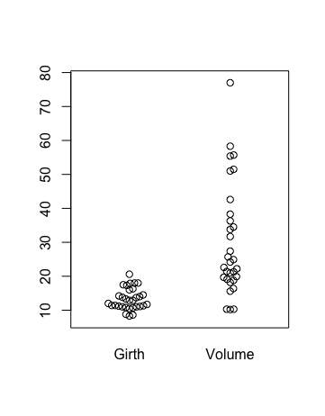
組み込みデータセット の trees を例にする。31 本の木について、胴回り Girth、高さ Height、容積 Volume を調べた以下のようなデータである。例として 1 - 10 行目を載せてあるが、31 行のデータがある。
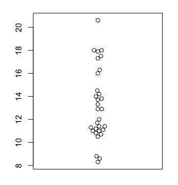
基本はシンプルで、beeswarm(vector) とする。
beeswarm(trees$Girth)
ベクターを複数入れたいときは、list を使わなければならない。col, xlab などの基本的な設定が使える。
beeswarm(list(A, B), labels = c("A", "B"))
# trees データセットで
beeswarm(list(trees$Girth, trees$Volume), labels = c("Girth", "Volume"))
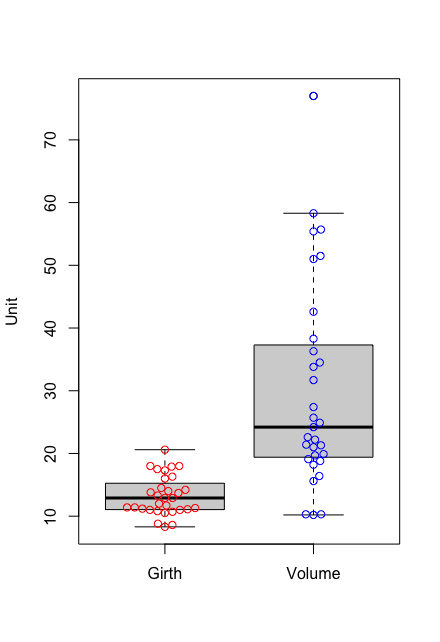
Beeswarm plot と boxplot を重ねる
boxplot と重ねるには、先に boxplot を作り、beeswarm で add = TRUE とする。軸ラベルなどは、boxplot の方で指定する。
beeswarm(list(trees$Girth, trees$Volume), col = c("red", "blue"), add = TRUE))
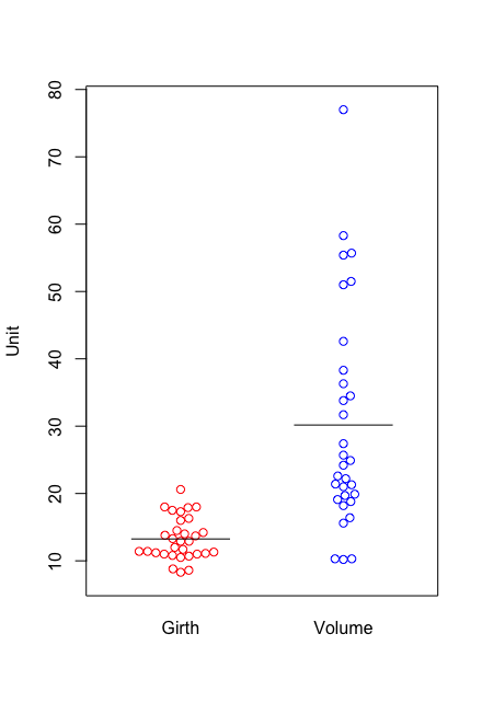
Beeswarm plot に平均値の直線を追加する
segments() 関数を使うのが一番簡単だろう。segments() 関数は、segments(x1, y1, x2, y2) で 2 点の座標を指定すると、その間に線を引く関数である。
例にある 0.7、1.3 などの x 座標は、もちろん図の大きさによって異なるので、マニュアルで微調整する。y 軸の値には mean を用いる。mean の代わりに 10, 20 などの数値を入れてみると、軸目盛りの 10, 20 の真横に来るので、y 座標はグラフの 0 から始まっているようである。
segments(0.7, mean(trees$Girth), 1.3, mean(trees$Girth))
segments(1.7, mean(trees$Volume), 2.3, mean(trees$Volume))
広告
References
Muhla et al. 2020a. Impact of using immersive virtual reality over time and steps in the Timed Up and Go test in elderly people. PLoS ONE 15, e0229594.- http://www.cbs.dtu.dk/~eklund/beeswarm/ Last access 2021/03/12, 2022/07/24 リンク切れ.
- Beeswarm in R. Link: Last access 2022/08/09.
コメント欄
サーバー移転のため、コメント欄は一時閉鎖中です。サイドバーから「管理人への質問」へどうぞ。